
Colour and Light
In Praise of Shadows: Why Japandi Needs Darkness
Western interiors treat shadow as a fault. Japanese aesthetics treat it as the medium materials become visible in. Why even lighting flattens everything you bought.
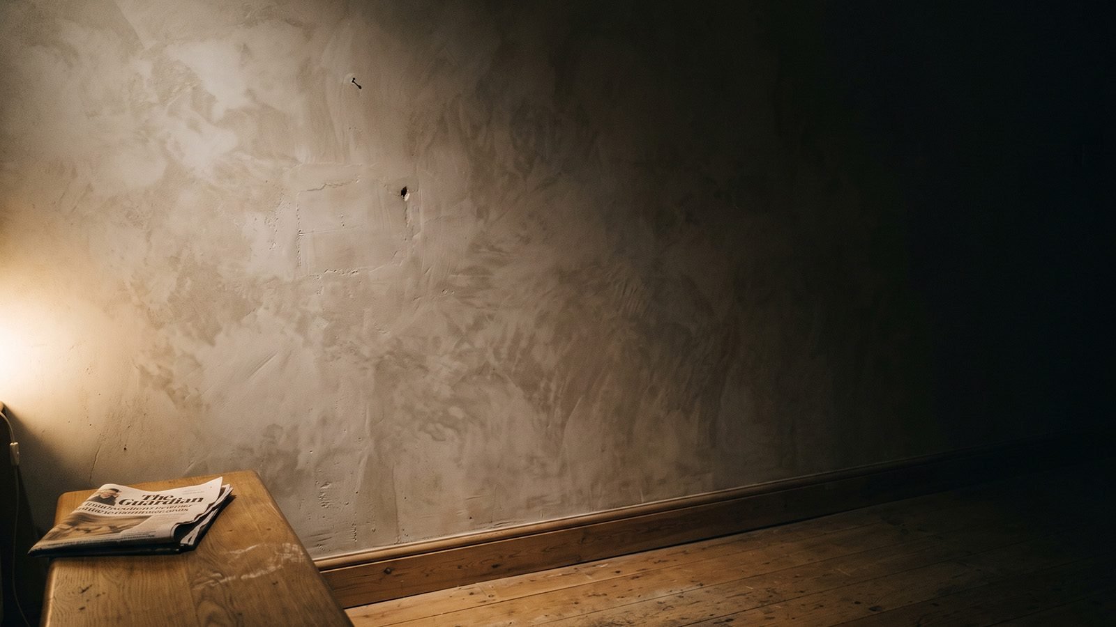
Western interiors treat shadow as a fault. Something to be eliminated with more fixtures, brighter bulbs and even coverage until every corner of a room reads at the same level. Japanese aesthetics treat shadow as the medium in which materials become visible at all.
That is not a poetic distinction. It changes where you put lamps, what finishes you buy, and why a perfectly lit minimal room can feel like nothing is happening in it.
The essay behind the idea
The reference point is a short essay by the Japanese novelist Junichiro Tanizaki, published in 1933, on the aesthetics of light and darkness. Its title translates roughly as In Praise of Shadows.
His argument, in summary rather than in his words: Japanese material culture developed in dim interiors, and its objects were designed for those conditions. Lacquerware, gold leaf, unglazed ceramics and aged wood were made to be seen by candlelight and filtered daylight, where they glimmer, shift and reveal themselves slowly. Under bright even electric light the same objects look flat and, to his eye, cheapened.
He extends it to architecture, to the deep eaves of traditional buildings, to the alcove that holds a single object in half darkness. The core claim is that beauty in this tradition is not located in the object. It is located in the relationship between the object and the shadow around it.
This is a summary, not a quotation. The essay is short, still in print, and worth reading properly if this interests you.
Why this matters for a Japandi room
Every material this style is built on is a low-light material.
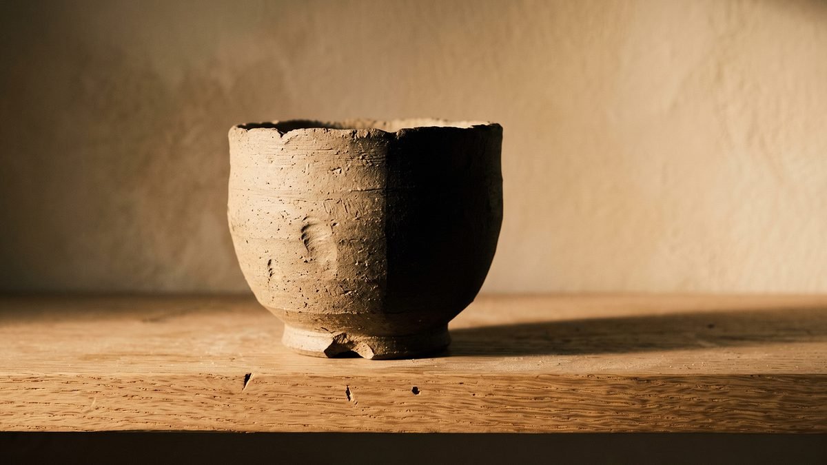
Unglazed ceramic has almost no specular reflection. Under flat overhead light it reads as a dull grey lump. Under low raking light the surface irregularity becomes legible and the object becomes interesting.
Matte and hardwax-oiled oak behaves identically. The grain only shows when light crosses it at an angle. Lit from directly above, it goes uniform.
Limewash and clay plaster are the clearest case. The entire value of these finishes is the mottled unevenness, and unevenness is only visible when there is a gradient across it. Light a limewashed wall evenly and you have paid a premium for something indistinguishable from flat paint.
Linen shows its weave in grazing light and disappears into a smooth field under diffuse overhead light.
So the room full of expensive natural materials that somehow looks cheap is often not a materials problem. It is that the lighting is destroying the only property those materials have.
Gradient is the goal, not brightness
The useful reframing: stop asking whether a room is bright enough and start asking whether it has a gradient.
A room with a range from bright near a lamp to genuinely dark in a far corner reads as deep. A room lit to an even level everywhere reads as flat, regardless of how warm the bulbs are.
This is why the standard advice to use several low warm sources rather than one bright one is right for reasons beyond mood. Multiple pooled sources create multiple gradients. One ceiling fixture creates a single flat wash.
Where to leave a room dark on purpose
This is the practical part, and it goes against most people's instincts.
Corners. Leave at least one corner of every room genuinely unlit after dark. It gives the room depth and it costs nothing. The instinct to put a lamp in every corner is what produces the even wash.
The upper half of walls. Light thrown from low sources falls off toward the ceiling naturally. Do not fight it. A dark upper wall makes a standard ceiling feel higher, not lower.
Behind and beside a displayed object. An object lit from one side with shadow behind it reads as three dimensional. The same object floodlit from the front reads as a photograph of itself.
Transitional spaces. Hallways and landings do not need to be bright. Passing from a dimmer space into a lit one is a large part of what makes the lit room feel warm.
The alcove approach
The traditional Japanese alcove holds one object, in reduced light, framed by architecture.
You can reproduce the logic without the architecture. Take a shelf, a niche, or the end of a console. Put one object on it. Light it from one side at a low angle rather than from above. Leave the surrounding area darker than the rest of the room.
The result is that the object becomes worth looking at in a way that the same object on a brightly lit shelf never is. It is the cheapest available upgrade to anything you already own, and it costs one repositioned lamp.
Where the idea has limits
Worth being honest, because this is a philosophy essay applied to a modern house.
You need to see to cook, to read, to work and to not fall down stairs. Task lighting exists for real reasons and there is nothing aesthetically superior about squinting.
The resolution is separation rather than compromise. Bright, functional, and if necessary cooler light where a task happens, on its own switch, used while the task happens and turned off afterward. Low, warm, gradient light for the rest of the time.
The failure is not brightness. It is one setting for a room that is used in several different ways.
What to change tonight
- Turn off every overhead fixture in the room you are sitting in.
- Leave one corner unlit. Resist filling it.
- Move one lamp so it lights an object or a wall from the side rather than from above or in front.
- Look at your limewash, your oak and your ceramics under those conditions. If they suddenly have surface where they did not before, that is the whole argument demonstrated in about ninety seconds.
Nothing on that list costs anything, which is fitting for an idea whose central claim is that what you take away matters more than what you add.
The Dark Layer is built for the room this article describes: nine assets around a single anchor colour, wall art and guides for a space that only works once you stop lighting every corner of it. See The Dark Layer.