
Dark Japandi
Hanging Art on a Dark Wall: Everything Inverts
On a dark wall every framing rule inverts. Scale, frames, mounts, hanging height and lighting for art on charcoal, plus the detail nobody mentions about drilling.
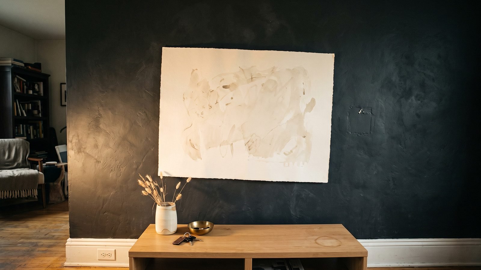
Art that looked considered on a warm white wall frequently looks wrong on charcoal, and the reason is not taste. Every rule you were working from assumed a light background, and against a dark one most of them invert.
This is the decision that current dark interior coverage abandons you at. It tells you to paint the wall and stops.
Contrast inverts, and so does the subject
On a pale wall, a dark or mid-toned piece reads as an object sitting on a surface. The wall recedes and the art advances.
On a dark wall, the relationship flips. A pale piece now reads as a window, an opening, a source of light. That is a genuinely different visual effect and it is far stronger than most people anticipate.
Used deliberately it is the most powerful thing you can do with a dark wall. Used carelessly it produces a bright rectangle punched into an otherwise calm plane, which pulls the eye and holds it whether you wanted that or not.
The working rule: on a dark wall, one pale piece at real scale. Not three medium ones. The effect only works when it is singular.
Scale changes, upward
Dark walls swallow small objects. A piece that felt correctly sized against warm white will look apologetic against charcoal, because the surrounding dark reduces its apparent size and the eye needs a larger target to read it as intentional.
Practical adjustment: go roughly one size larger than you would have chosen for a pale wall. If you were considering a piece around 24 by 36 inches, look at 30 by 40.
For a piece above a sofa or a console, aim for the artwork to span somewhere around two thirds of the furniture width. On a pale wall you can get away with half. On a dark wall half looks lost.
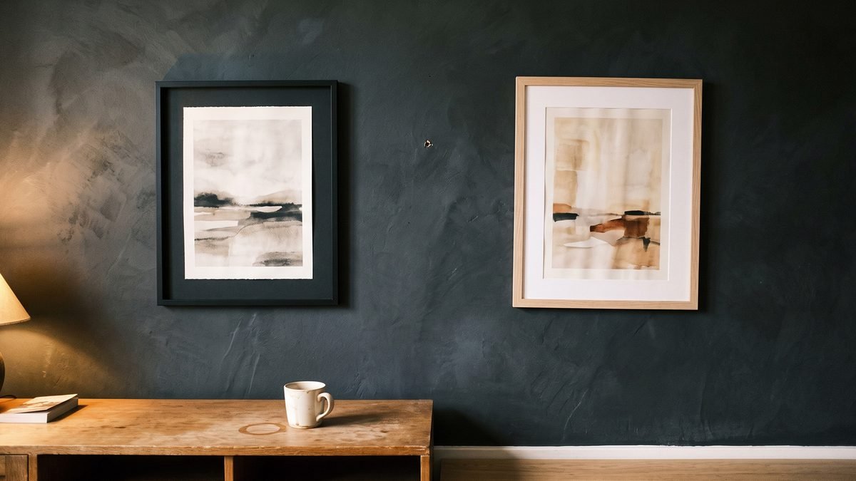
Frames, and when they should disappear
Three approaches, and only two of them work.
Frameless or float mounted. The cleanest option on dark walls. Nothing interrupts the transition from art to wall, and the piece reads as a plane of light rather than an object in a box.
A dark frame that merges into the wall. Matte black or charred timber on charcoal. The frame vanishes, the art appears to float, and you get physical protection without visual interruption. This is the safest choice.
A pale or natural oak frame. This is the one to be careful with. Against a dark wall a light frame becomes a bright outline, and the eye now reads the frame rather than the art. It can work when the frame is deliberately part of the composition and the piece is large, but on anything small it turns your artwork into a picture of a frame.
What almost never works: ornate, gold, or high-contrast frames. Reflective frame finishes also fail for the same reason satin paint fails, they catch every light source in the room.
Mounts and matting
A wide white mount is standard practice in gallery framing and it is usually wrong here.
On a dark wall, a broad white border becomes the dominant bright element and the artwork inside it becomes secondary. You end up looking at a white rectangle with something in the middle.
Better options: no mount at all, a narrow mount rather than a wide one, or a mount in a tone that sits between the art and the wall rather than at the extreme light end. Warm grey, clay and deep taupe all work where bright white does not.
If you already own pieces in wide white mounts and want to keep them, group them somewhere else in the house and let the dark wall carry a single unmounted piece.
Hanging height drops again
Japandi already wants art hung lower than conventional practice, closer to seated eye level than standing. On a dark wall, drop it slightly further.
The reason: a dark wall's mass reads heaviest at the top of the room, where there is least light. Art hung high sits in the darkest part of the plane and loses definition. Bring it down into the zone where your low lamps are actually throwing light and the piece stays legible after dark, which is when this room is used.
Practical target: leave roughly six to eight inches between the top of a console or sofa back and the bottom of the frame, and let the piece sit low rather than centred on the wall's full height.
Lighting it without a spotlight
The instinct is to aim a light at the art. Resist it.
A directional spot on a dark wall creates a hard-edged bright pool with the artwork inside it, and the whole arrangement immediately reads as retail display. It also flattens the mineral texture of a limewashed wall, which is one of the main reasons to have a dark wall in the first place.
What works instead: a low warm lamp positioned to the side, throwing light across the wall at a shallow angle. The piece is lit, the wall texture survives, and the light source stays low where this style wants it.
If a piece genuinely needs dedicated lighting, a wide wash at low intensity beats a narrow beam every time.
The one-piece rule, enforced harder
Gallery walls are a poor fit for this style generally. On a dark wall they are close to unworkable.
Multiple frames against charcoal produce a scatter of bright and dark rectangles with no clear hierarchy, and the negative space between them, which is what makes a gallery wall work on white, disappears into the dark ground.
One piece. If you genuinely need two, hang them far apart on separate walls rather than as a pair.
The practical detail nobody mentions
Dark matte walls show every hole, mark and touch-up. Flat charcoal limewash in particular does not take a patch invisibly.
Which means: measure properly and drill once. On a pale eggshell wall a repositioned nail hole is a two minute fix. On a matte charcoal wall it is a visible mark you will see every time you walk in.
Mark the position with a pencil, step back, live with the pencil mark for a day, and only then drill. It sounds excessive and it is considerably less excessive than repainting a wall because you hung something two inches too high.
The honest answer to what works against a charcoal wall is that it depends which direction your room is going, and most people find out after they have already bought. The Complete Collection carries all 17 assets across both the light and dark palettes, so the wall decides and you are already covered either way. See the Complete Collection.