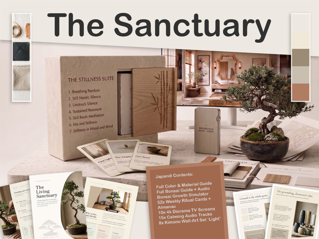
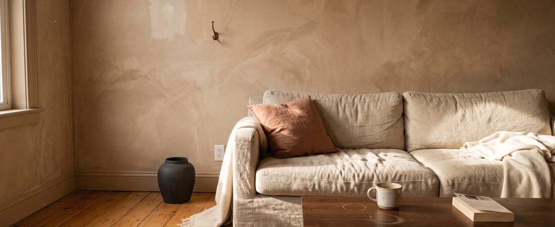
If you built this room in 2021 or 2022, the thing making it feel slightly off is not your furniture. It is that you painted it in a colour family the style has since moved away from, and cool greige is now doing to Japandi what beige did to Tuscan kitchens.
The good news is that the fix is almost entirely paint, bulbs and textiles. The furniture that felt expensive at the time is still correct.
What actually changed
The early version of this style was neutral and cool. Grey-leaning whites, cool greige, black accents, pale ash. Handsome, restrained, and photographed beautifully on a white screen.
Multiple independent reports through this year describe the same movement: the palette has warmed. Richer earth tones, terracotta accents, aged brass hardware, honey-toned wood finishes. The current family reads as warm white, sand, clay, soft charcoal, muted sage and natural wood, with restrained accents of terracotta, moss green and soft indigo.
The consistency across sources is what makes this worth acting on. When four unrelated publications describe the same shift in the same direction, it is a movement rather than one magazine’s opinion.
Why cool greige reads as dated now
Two mechanisms, and neither is about the colour being ugly.
It fights the materials. Warm oak next to a cool grey wall makes the oak look orange. That was tolerable when the whole scheme was cool and the wood was pale ash. Once the style shifted toward honey oak and clay, the cool wall became the odd element in its own room.
It carries a date stamp. Cool greige was the dominant American interior neutral for roughly a decade. Anything that saturated becomes a time marker, the way a specific shade of avocado marks a kitchen. It is not that people dislike it. It is that they can date it on sight.
The replacement family
Think in undertone rather than in names, because paint names are marketing and the undertone is what your eye reads.
Warm white and sand for the majority of walls. Yellow or red undertone, never blue or violet.
Clay and terracotta as the accent that has done most of the work in this shift. Muted and dusty rather than bright. Used on one wall, in textiles, or in ceramics.
Muted sage as the green, if you want one. Grey-green rather than fresh green.
Soft charcoal replacing hard black. This is the same shift the dark branch of the style is built on: an anchor that is deep and warm rather than absolute.
Honey oak and walnut replacing pale ash and grey-washed wood. Grey-washed flooring is the single most dated element in most of these rooms.
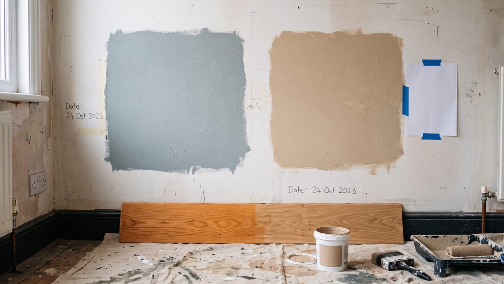
I am deliberately not publishing hex codes. The ones circulating in current coverage come from single commercial sources and I have not verified any of them against actual paint decks. Sample properly instead.
What to keep
This matters as much as what to change, because the temptation once you notice a problem is to replace everything.
Keep all your oak, walnut and ash furniture. Wood is warm by nature. It was never the problem.
Keep every natural textile. Linen, wool and jute are undertone-neutral and work in both palettes.
Keep your ceramics. Unglazed and matte stoneware is fine.
Keep the furniture proportions. Low is low. Nothing about scale has shifted.
Keep black hardware if you like it. Blackened steel still works. It has simply lost its monopoly to aged brass.
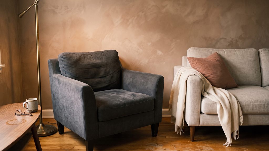
Realistically you are changing paint, bulbs, two or three textiles and possibly a rug. That is a few hundred dollars against a room that felt like it needed replacing.
The overcorrection to avoid
The failure mode is going too far into orange.
Warm does not mean saturated. Terracotta used at scale on walls reads as Mediterranean rather than Japandi, and honey oak plus a warm wall plus warm bulbs plus a rust textile plus brass hardware produces a room with no tonal relief in it at all.
Keep the anchors. One soft charcoal element and one genuinely pale element in every room. The warmth is a shift in the middle of the range, not an abandonment of both ends.
The five minute check
Stand in the room in daylight and do this:
- Hold a sheet of printer paper to the wall. Blue, grey or violet against it means cool.
- Look at your wood against the wall. If it reads orange, the wall is the problem, not the wood.
- Check one bulb. 4000K or above and the whole assessment is unreliable until you swap it.
- Find your greyest textile. That is usually the fastest single upgrade.
- Look at the flooring. Grey-washed is the one element that genuinely dates a room and genuinely costs money to fix. Everything else on this list is cheap.
If item five is your problem, work around it rather than replacing it. A large warm rug and warmer walls will pull a grey floor most of the way back, and that is a far better use of the budget than new flooring.