
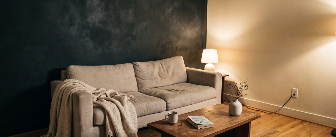
A dark room does not fail because it is dark. It fails because it is uniformly dark, and once the eye has nothing pale to measure against, the brain stops reading depth and starts reading enclosure.
That is the entire difference between the moody Japandi rooms circulating this year and the ones people actually produce at home. The successful ones are not darker. They are higher contrast.
Why the style turned
Japandi arrived as an airy, light-filled proposition. Pale oak, warm white walls, daylight. For several years that was the whole visual identity.
The shift toward charcoal, deep rust and grounded interiors is the most consistently reported change in the style this year. The stated reason across the coverage is psychological rather than aesthetic: people want homes that feel protective. Enclosure is being sought deliberately rather than avoided.
That instinct is sound. The execution is where it collapses, because most people interpret it as darkening everything.
The cave failure
Here is what goes wrong, in sequence.
Someone paints the walls charcoal. The existing furniture is mid-tone. The floor is a mid-brown wood. There is a grey sofa and a charcoal rug because those were already there and they seem to fit the new direction.
The result contains no light reference point. Every surface sits within the same narrow tonal band, and a room without tonal separation reads as flat regardless of how expensive the individual pieces were. Add a north-facing window and the room stops being moody and becomes gloomy, which is a different feeling entirely and not one anyone wants at seven in the evening.
Moody is high contrast. Gloomy is low contrast in a dark register. Almost everyone who tries this and hates the result has produced the second one.
The 70/30 rule
Working proportion for a room going dark: roughly 70 percent of the visible surface area stays light, 30 percent goes dark.
That sounds like far less dark than the reference images suggest, and it is, because photographs are shot from the angle that maximises the dark plane. Stand in the actual room and the same wall occupies a fraction of what you see.
Thirty percent is enough to change the entire character of a space. Beyond about half, you need considerably more skill and considerably more daylight than most rooms have.
Which surface should take it
Not all surfaces are equal candidates, and the most common choice is the worst one.
Walls: yes, and preferably one. A single dark plane behind the main seating or the bed. It sits in your peripheral vision rather than your direct sightline, which is where you want mass.
Floor: usually wrong. Dark flooring absorbs the light that would otherwise bounce back up into the room, and it makes ceilings feel lower. It also shows every crumb, hair and footprint, which is a maintenance problem people underestimate badly. The current trend coverage pushes darker floors hard. In a room with less than excellent daylight, resist it.
One large furniture piece: excellent. A charcoal sofa or a charred timber console gives you the mass without touching the architecture, and it is reversible. This is the safest entry point.
Ceiling: only in a room with real height and real light. It works spectacularly when it works and it is unrecoverable when it does not.
Millwork and doors: quietly effective. Matte black interior doors against pale walls give high contrast with almost no light loss, because the surface area is small.
Sheen is more important than colour
This decides more than the shade you pick, and it is where most dark rooms are lost.
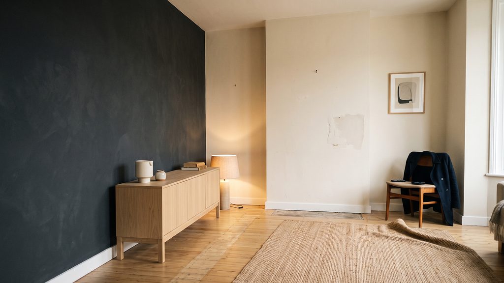
A dark surface with any sheen becomes a mirror. Every light source in the room reflects off it as a bright spot, the wall texture disappears, and the depth you were paying for turns into a flat reflective plane with hotspots on it.
Dark surfaces must be dead matte. Flat paint, limewash, clay, charred and brushed timber, matte lacquer at most. Eggshell is already too much on a charcoal wall. Satin is a disaster.
This is also why limewash and clay finishes perform so much better than paint in a dark room specifically. The uneven mineral surface scatters light in a way that keeps the wall alive at close range, where flat paint just goes solid.
The pale anchor
Once a dark plane exists, at least one genuinely pale element must sit against it. Not mid-tone. Pale.
Oatmeal linen upholstery. A cream wool throw. An unglazed off-white ceramic vessel. Light oak. The contrast is the entire point, and burying the dark plane among greys and browns wastes it.
The quick test: photograph the room on your phone and convert the image to black and white. You should see clearly separated light, mid and dark bands. If the whole frame sits in one grey band, you have a contrast problem rather than a colour problem, and no amount of restyling within that band will fix it.
Lighting a dark room
Dark surfaces absorb light, so a dark room needs more sources at lower output, not fewer.
Three or four warm points at low levels rather than one bright fixture. Every one of them low in the room, which is where Japandi wants them anyway. Table lamps, floor lamps, a low shelf light.
What to avoid: directional downlights aimed at the dark wall. A spotlight on a charcoal surface creates a bright pool with a hard edge and immediately reads as retail display lighting. If you want the wall lit, wash it from a low angle or let ambient light find it.
Warm colour temperature matters more here than in a pale room. Cool light on charcoal reads as concrete. The same wall under 2700K reads as soft and deep.
When not to do this at all
Some rooms should stay light, and it is worth saying plainly.
North-facing rooms with one small window. There is not enough incoming light for contrast to function. You will get gloom.
Rooms under about 120 square feet with a low ceiling. Dark planes in a small volume compress it further. The entryway and the bathroom are usually the wrong places.
Rooms used mainly in daylight hours. A home office that goes dark fights you every working morning.
Rooms where you cannot control the sheen. If you are renting and the walls are satin finish builder-grade paint, a dark colour on top of that surface will look worse than the pale version you started with.

The order to do it in
- One large textile first. A charcoal throw, a dark rug, dark curtains on one window. Cheap, removable, and it tells you within a week whether you actually want this.
- One furniture piece. If the textile worked, add mass. Still reversible.
- One wall, matte. Only now. Sample it at a full square yard and look at it at three points in the day before committing.
- Pale anchors last. Once the dark exists, work out what needs to sit against it. Usually less than you expect.