
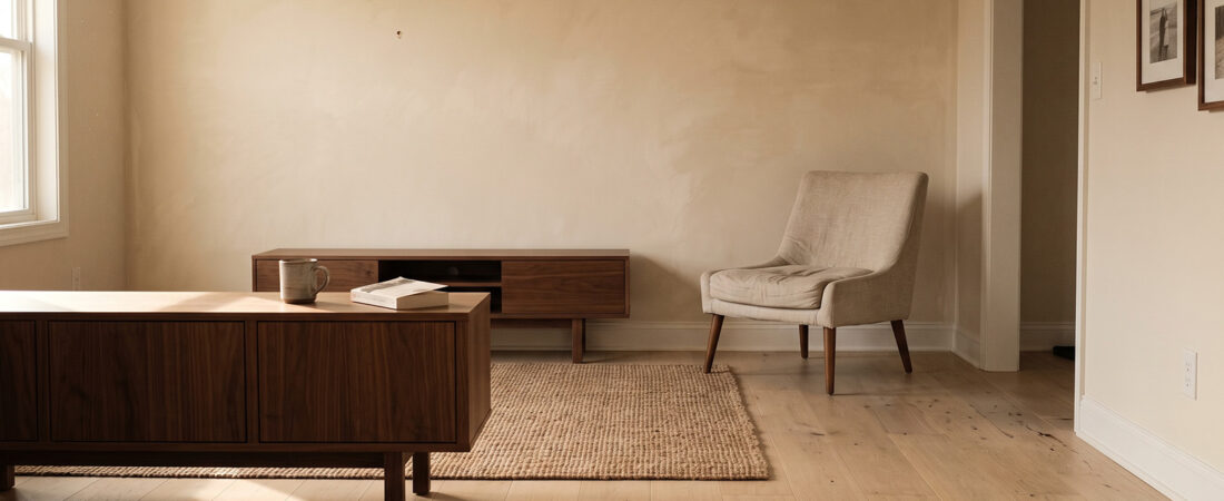
Matching every wood in the room is not the safe choice. It is the choice that makes a room look like it was bought in one transaction from one catalog, which is the opposite of what this style is built on.
The fear is understandable. Mix woods badly and a room looks like a thrift store. Mix them well and it looks collected over years. The difference is not taste, it is a set of rules you can apply in an afternoon.
Undertone is the only thing that actually has to match
Every wood carries a color bias underneath its surface tone. Cherry and mahogany run red. Pine and older oak run yellow or orange. Walnut runs a cool grey brown. Some commercial finishes push maple toward pink and some grey wash oak into blue territory.
You can mix light with dark all day long. You cannot mix a red undertone with a grey undertone in the same sightline without the room feeling subtly wrong in a way most people cannot name.
The test: put a scrap or a sample of each wood next to each other on a white surface in daylight. Squint until the detail blurs. What you see left is undertone. If one leans pink and another leans grey, they will fight no matter how well they are styled.
Japandi lives almost entirely in the warm neutral band. Choose woods that sit there and the rest of this article gets much easier.
Pick one foundation wood and give it the floor
The foundation wood covers the largest continuous surfaces in the room. Usually that is flooring. Sometimes it is a run of built in shelving or a large dining table.
For Japandi this should be a light wood: white oak, ash, or maple. This is the Scandinavian half of the equation doing its job, keeping the room bright and open before any of the Japanese restraint gets layered on top.
One thing that trips people up constantly: your floor is a foundation, not a tone you have to match. Buying furniture in the same species and finish as your flooring is the single fastest way to make a room look flat. The floor is a backdrop. Furniture sitting on it should read as a separate layer.
Then add exactly one grounding dark
The second wood is your anchor. Walnut, teak, or charred timber. This is the Japanese half, the visual weight that stops all that pale oak drifting into Scandinavian showroom territory.
One. Not three. A room with light oak plus walnut reads as deliberate. A room with light oak plus walnut plus teak plus a mid brown mystery wood reads as accumulated by accident.
This is where a small number of well chosen pieces earns its keep. A single dark side table, a slim console, or a set of picture frames will do more work than a whole room of mid tone furniture. Most rooms only need one or two dark pieces in total.
The rule of repetition: three touches minimum
Here is the rule that separates intentional from accidental, and almost nobody follows it.
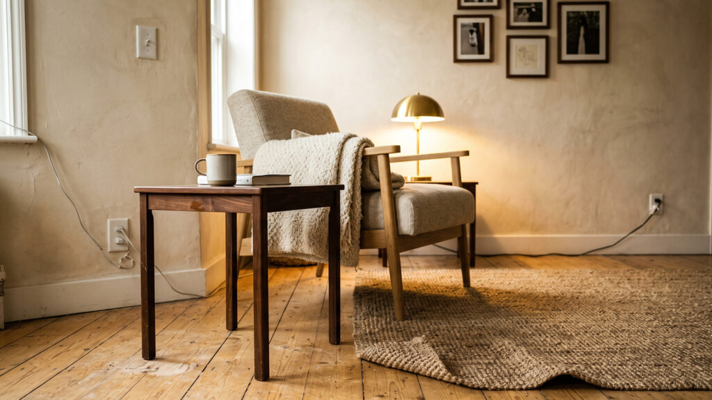
Your accent wood must appear in at least three separate places in the room. One dark object in a room of light wood reads as a mistake, something left behind from a previous apartment. The same wood appearing three times reads as a decision.
The three touches do not need to be the same size. A walnut console against one wall, walnut picture frames on another, and walnut legs on an accent chair is plenty. The eye connects them, finds a pattern, and stops asking questions.
Spread them apart. Three dark objects clustered in one corner just makes a dark corner. Push them to different walls so the eye has to travel, which incidentally makes a small room feel larger.
Getting wood tones right is mostly about deciding your constants once and then refusing to move them.

Grain scale is a second, quieter variable
Two woods can share an undertone and still clash if their grain patterns compete. Red oak has a busy, cathedral grain that draws the eye. Maple is almost blank. Rift sawn white oak has straight parallel lines with very little figure, which is exactly why minimalist designers pay a premium for it.
As a working rule: one busy grain per room, maximum. If your flooring has strong figure, keep the furniture quiet. If your floors are calm rift sawn oak, you can afford a dining table with more character.
This is also why Japandi favors quarter sawn and rift sawn cuts. The straight grain reads as calm at a glance, which matters enormously in a room that has nothing else going on visually.
Separate two woods with something that is not wood
When two different woods touch directly, the difference between them becomes the subject. When something sits in between, the eye reads them as separate layers instead of comparing them.
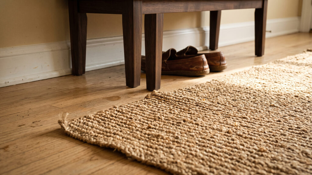
A jute rug between a walnut console and an oak floor. A linen runner across a dining table. A stone or ceramic object on a wood shelf. Even a gap of empty floor works.
This is the practical reason Japandi rooms lean on natural fiber rugs so heavily. They are not just texture, they are separation. If your wood mixing looks off and you cannot work out why, check whether two of your woods are physically touching, and put a rug or a runner between them before you conclude one of them has to go.
Metals count as a third material, so limit them too
Every hardware finish, lamp base, and hinge in the room is another material in the mix. Brushed brass, blackened steel, and chrome in the same room will undo careful wood work.
Japandi tolerates two metals at most, and one is safer. Blackened steel or matte black is the default because it echoes the grounding dark without adding a fourth wood. Aged brass works if your palette leans warm and yellow. Chrome and polished nickel almost never work here, because their cool blue cast fights the entire warm neutral scheme.
When you genuinely cannot match, paint it
Sometimes a piece you own is the wrong undertone and you are not replacing it. A mid brown cherry bookcase in a warm oak room is a real problem with a real solution: take it out of the wood conversation entirely.
Paint it in a warm off white close to your wall color and it reads as architecture rather than furniture. It disappears, the room calms down, and you have removed a conflicting wood without spending anything. Designers do this constantly and never talk about it.
The five minute wood audit
Stand in the doorway of the room and run this:
- Count distinct wood tones. More than three, remove one. Two plus a painted piece is ideal.
- Squint. Any wood leaning pink, red or grey while the others lean warm neutral is the odd one out.
- Find your darkest wood. Count how many places it appears. Under three, add a touch. Over five, you have two foundations and no accent.
- Check for contact. Any two woods touching directly, separate them with fiber, stone or empty space.
- Count grain busyness. More than one loud grain, quiet one down.
- Count metal finishes. Over two, consolidate.
Getting wood tones right is mostly about deciding your constants once and then refusing to move them.
Start with subtraction
Most rooms with a wood problem have too many woods, not the wrong ones. Before buying anything, remove the single piece that fits least and live with the gap for a week.
Rooms almost always improve. The gap you were afraid of turns out to be the negative space the style was asking for, and the money you were about to spend stays in your pocket until you know what the room actually needs.